Project Brief
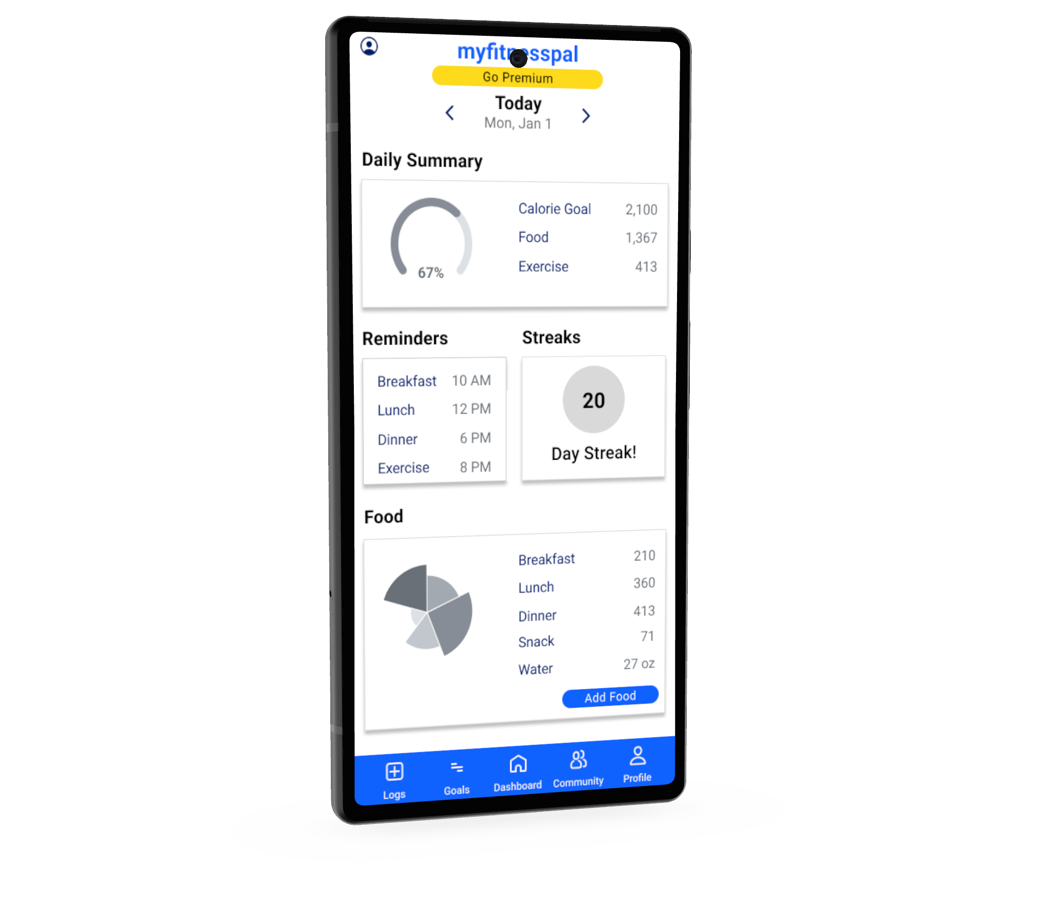
The current parking system NJIT has. As seen in the picture, it is really simple, only showing three information: the location, available spots, and total spots. But the availability is always incorrect, as seen in the picture, where there are negative spots.
Secondary Research
Problem scenario created for the persona Sarah. Sarah is a junior with a 40 minute commute daily. Her needs are to find spots efficiently, safe, and close to campus so she could get to classes on time. Her frustration is that she often have to go to multiple parking decks before she can find parking, or even resort to street parking. Which puts her car at risk, and makes her late to classes.
Primary Reseach
Activity scenario for Sarah. After implementing our solution, Sarah would be able to check for availability parking before she gets to the desks, ensuring efficiency, since she doesn't have to drive around the desks searching for spots anymore. She sees that there are spots available in the app, and she also sees lights indicating availability in the decks. She is able to find parking quickly and get to class on time.
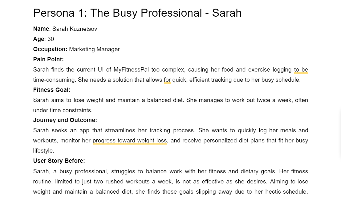
Personas
Flowchart for the app, walking through the steps from logging in to finding spots and purchasing a pass. My teammate in management and computer mainly worked on this part, but I also helped and contributed.
Journey Map & App User Flow
These are paper prototypes for the app based on the flowchart. Our team created a paper for each screen the users would need in the app, and drew basic functions and interfaces for the screens. Our team then found 5 people around the school, with 3 commuters, 1 dormer with a car on campus, and a professor. We took notes on their actions, and improved the flow.
Wireframing
After finishing testing for the paper prototype, I created the high fidelity prototype in Figma. Keeping in mind the problems the users have and improved them. Then we invited 5 different people to help us test and evaluate. Finally, I made final adjustments and improvements based on the feedbacks.
User Testing
After finishing testing for the paper prototype, I created the high fidelity prototype in Figma. Keeping in mind the problems the users have and improved them. Then we invited 5 different people to help us test and evaluate. Finally, I made final adjustments and improvements based on the feedbacks.
Final Prototype
After finishing testing for the paper prototype, I created the high fidelity prototype in Figma. Keeping in mind the problems the users have and improved them. Then we invited 5 different people to help us test and evaluate. Finally, I made final adjustments and improvements based on the feedbacks.